Web Typography Recap for 2025

When it comes to web design, typography often sits quietly in the background, but don’t let its subtlety fool you. The fonts you choose can make or break how your content is perceived, how users interact with your site, and even how quickly your pages load. In this article, we’ll explore the latest typography trends, practical tips for choosing and optimizing fonts, and how to choose the right font for your content. We don’t want to focus too much on particular fonts, rather than just update ourselves with some information on what to focus for the upcoming year.
What’s hot?
The world of typography is constantly evolving, and 2024 is no different. We’re seeing a rise in bold, expressive fonts that pack a visual punch and variable fonts that adapt seamlessly to different devices and layouts. Serif fonts are also making a bit of a comeback, blending vintage charm with a modern twist. Whether it’s playful typography for a creative brand or clean, minimalistic fonts for tech-driven websites, the trend is all about individuality. Your font choices should reflect your brand personality — because what you say matters, but how you say it matters even more.
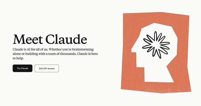
Additionally, a new phenomenon has been taking place: The rise of “sans-ification” in logo design. This refers to the increasing shift toward simplifying logos, often using sans-serif fonts to achieve a clean and modern look. This movement is particularly noticeable in 2024, driven by the desire for clarity and adaptability across digital platforms. Several high-profile brands have embraced this trend, replacing their iconic logos with sleek sans-serif designs. The shift is supposed to align with modern branding priorities, ensuring logos work well in small formats like app icons while maintaining legibility and professionalism.
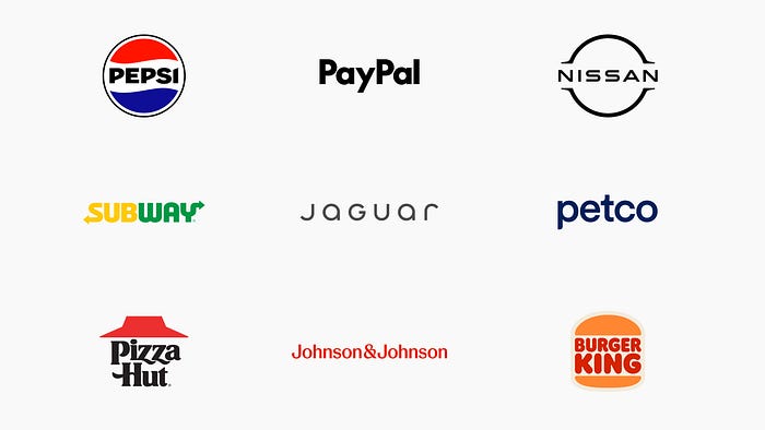
As to any controversial topic, this coin too has two sides depending on how you look at it. On one hand, this minimalist approach reflects broader design trends emphasizing functionality and accessibility. Tech companies and digital-first brands, in particular, favour sans-serif styles to convey innovation and modernity. One big reason is the growing need for simplicity in a visually cluttered world. Sans-serif fonts help brands stand out for all the right reasons — clean lines, no frills, just effective communication.
On the other hand, while “sansification” gives logos a polished and professional feel, it can also lead to a loss of personality, which can make differentiation challenging in saturated markets. When everyone opts for the same minimalist aesthetic, it takes extra creativity to make your brand memorable. The challenge is finding a balance between timeless simplicity and distinctive character — something every designer should aim for when choosing typography.
Choosing the Right Font
Selecting the perfect font goes beyond aesthetics — it’s about aligning with your message. A playful font may work if you aim for a more casual tone but would feel out of place on a law firm’s website. Think about your audience, your brand’s personality, and the emotions you want to evoke. Fonts, after all, are silent storytellers. They can scream confidence, whisper elegance, or spark curiosity.

Typography isn’t just about legibility; it’s about communicating tone and intention. The same sentence written in Helvetica, Times New Roman, or Trajan feels entirely different because fonts carry their own connotations. For example, a strong, bold font like Impact signals urgency, while a delicate script conveys elegance. Understanding how your font choices influence perception can elevate your design and ensure your content resonates with your audience.
Optimizing web fonts
Beautiful typography doesn’t have to slow you down, when it comes to optimizing fonts for website speed, the devil is in the details. Here are some key practices to help ensure your fonts don’t slow down your site while still looking great:
1. Use Fewer Font Variants
Each additional font weight or style adds a separate request to the server, increasing load times. Stick to the essentials — typically one or two weights (e.g., regular and bold) are sufficient for most designs. Limiting the number of typefaces also minimizes the overall impact on performance.
2. Asynchronous Font Loading
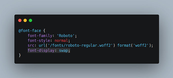
A large part of the rendering process is usually taken up by loading web fonts — asynchronous loading ensures that your web fonts don’t block the rendering of your page. Using techniques like font-display: swap in your CSS allows the browser to display fallback fonts while the custom web fonts load in the background. This approach keeps your content visible, improving the user experience. Some practices recommend also trying out font-display: optional, which gives the font face an extremely small block period, helping maintain a low Cumulative Layout Shift (CLS) metric. (We covered more details about web optimization here)
To further enhance font loading performance, tools like Web Font Loader, provide advanced control over how fonts are loaded. Additionally, best practices such as pairing custom fonts with well-matched fallback fonts ensure that the user experience remains consistent, even before the custom fonts load. Regularly testing your site’s performance with tools like Lighthouse or PageSpeed Insights can help identify any font-related bottlenecks, ensuring your typography strategy aligns with both aesthetic goals and performance metrics.
3. Use Modern Font Formats
Not to sound like a broken record, since this should be adopted widely by now, but using modern formats such as WOFF2 can significantly reduce file size compared to older formats. WOFF2 is essentially a compressed format designed specifically for web use to help with quicker delivery and parsing by the browser.
4. Variable Fonts
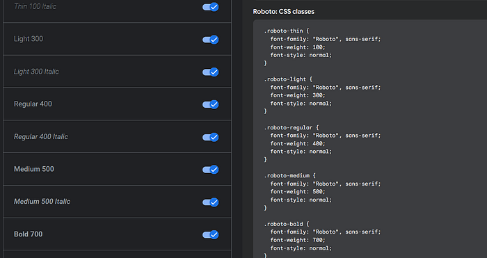
Now this is something that we would like to discuss in a bit more detail. Since font variation is already supported by all modern browsers and OS (via caniuse), they make an especially good option to use for the web. Variable fonts unify multiple font weights and styles into a single file. While they can be slightly larger than a single static font file, they eliminate the need for multiple requests, making them a great choice for sites needing diverse typography without compromising speed. Variable fonts essentially remove the explicit distinction between different weights and styles, which have existed since the early days of typesetting. It’s no exaggeration to say that this represents a huge leap forward in font technology in recent years.
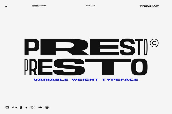
You can find a great collection of variable fonts on websites such as V-Fonts, additionally, if you’re looking for free alternatives only, Google Fonts has an option to filter out only those!
5. Optimize Delivery
If you’re choosing to self-host, serve them through a Content Delivery Network (CDN) to decrease latency for global visitors. Tools like Google Fonts and Adobe Fonts already optimize font delivery through their infrastructure, but if you’re choosing a more privacy-oriented approach, you can use a custom CDN solution. Incorporating these practices ensures that your typography enhances your website’s aesthetics without compromising its speed or performance. By balancing design with technical efficiency, you can create a seamless experience for your users.
Conclusion
As we wrap up this exploration of typography, it’s clear that the role of fonts in web design is as dynamic as ever. We’ve covered the rise of expressive and variable fonts, the essential steps to optimize typography for performance, and how thoughtful font choices can shape the way your audience perceives your content. These aren’t just technical or aesthetic decisions — they’re foundational to creating meaningful user experiences.
Looking ahead to the coming year, the focus remains on balancing creativity with functionality. With typography trends leaning toward personalization and performance, brands need to embrace fonts that not only capture their essence but also prioritize accessibility and speed.
Remember, the beauty of web design lies in the details — and typography is one of the most powerful details you can master.
Do you like our ideas? Whether you’re looking to refresh your existing website or build something completely new, let’s discuss how we can support your digital journey.
- DART Studios | Design and Development Agency
